
The NBC (National Broadcasting Company) is one of the biggest American television networks. I think most of you have already seen the peacock in this logo. The peacock has 6 different tail feathers, referring to the six divisions at the time that this logo was created. The peacock’s head is flipped to the right to suggest it was looking forward, not back.
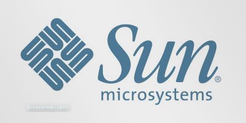
The Sun logo is one of the most famous ambigrams in the world. You can read the brand name in every direction; both horizontally and vertically. This logo was designed by professor Vaughan Pratt of the Stanford University.

At first, this logo might not make much sense. But if you look closely, you’ll see the number 1 in the negative space between the F and the red stripes. I also love how this logo communicates a feeling of speed.

Unilever is one of the biggest producers of food, beverages, cleaning agents and personal care products. They produce a huge amount of different products and they wanted to reflect this in their logo. Each part of the logo has a meaning. For example: the heart represents love, care and health - feeling good, a bird is a symbol of freedom. Relief from daily chores – getting more out of life.

Carrefour is one of the biggest European retailers, and it’s also French for “crossroads”. The logo symbolizes this word via two opposite arrows. They also added the first letter of the name, because if you look closely you’ll see the letter C in the negative space between the two arrows.

Sony Vaio is a well known brand of laptops. But did you know that the name Vaio logo also had a hidden meaning? Well, the first two letters represent the basic analogue signal. The last two letters look like a 1 and 0, representing the digital signal.

The old logo of Baskin Robbins had the number 31 with an arc above it. The new logo took this idea to the next level. The pink parts of the BR still form the number 31, a reference to the 31 flavours.

Toblerone is a chocolate-company from Bern, Switzerland. Bern is sometimes called ‘The City Of Bears’. They have incorporated this idea in the Toblerone logo, because if you look closely, you’ll see the silhouette of a bear.

Continental is a manufacturer of tyres. You could actually see this in their logo, because the first two letters create a 3-dimensional tyre.

This is probably one of the best known logos with a hidden meaning. If you look closely, you’ll see an arrow that’s formed by the letters E and x. This arrow symbolizes speed and precision, two major selling points of this company.

This logo doesn’t seem to hide much at first sight, but it gives you a little insight in the philosophy behind the brand. First of all, the yellow swoosh looks like a smile: Amazon.com want to have the best customer satisfaction. The swoosh also connects the letters a and z, meaning that this store has everything from a to z.
Hey! My friends, If you like my post you can save it using "Save Page as PDF" button below and you can even share them to your friends with social networking buttons provided below this post.


2 comments:
Wow !
Interesting...
:)
Thanks!
Post a Comment
Hey Guys! Thanks for visiting my blog. Hope you enjoy reading. Just leave your comments if you think this post is a worth readable! Your valuable comments are always welcomed. Please don't spam! and No abusive language would be tolerated. I would moderate your feedback and then it would be published. If you have any query I will try to give feedback as soon as possible.